Wednesday
Feb032016

Introducing Dash of Bleu

When I posted that Urban Fabrics had reached the end of its road, I mentioned that Mike and I were working on our next endeavor. That next thing is Dash of Bleu.

Dash of Bleu is a new line of kitchen accessories that have simple modern elegance paired with classic utility. We are focused on crafting beautiful and functional accessories that look great in the kitchen. We believe that a focus on design and elegant simplicity will be the defining character of our products and we believe that there is a place in the market for those products.

Our flagship product is an elegantly simple white ceramic salt box with a bamboo lid.

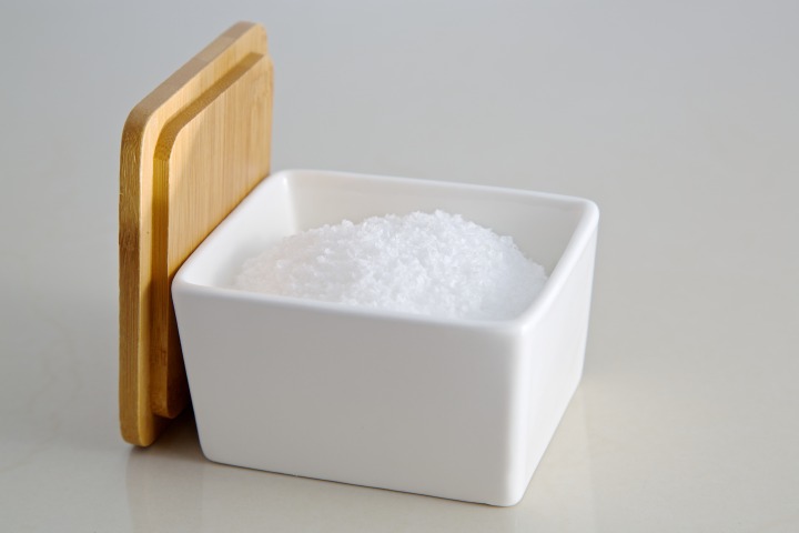
A salt box (sometimes also called salt cellar or salt keeper) is a great way to keep salt handy while cooking. In fact, Epicurious editors included having a salt keeper on their top 57 Things You Can Do to Be a Better Cook Right Now

Since the job of a salt box is to keep salt always within reach, this is a kitchen accessory where aesthetics really matter. A salt box is typically left on the counter so that it is always there ready for you to add just the right pinch of salt to you dish. We felt this was the perfect product to start out our brand with since it is important that it be both functional and beautiful. And we felt that there would be a pretty good market for it — if you cook you could probably use one.

We approached the design of our salt box with the idea of simplicity and modern elegance as our guide. What we came up with is a simple white ceramic box that slightly tapers to the base. On top is a simple naturally finished bamboo lid. That’s it. Clean. Simple. Pure.

Of course, what goes in the salt box is a very personal matter. From kosher salt to sea salt and from Himalayan salt to flavored salt; we think they all work great. In fact, there is no reason to limit it to just salt. Any kind of spices or seasonings that are used regularly would go well in our salt box. One of our earliest customers mentioned in their review that they use the salt box as a holder for sweetener packets which seemed like a great idea to us.

We’ve been selling our salt box on Amazon since October 2015 (I know, this announcement seems a bit late…). We have sold over 600 salt boxes as of this post which we are pretty happy with.

We are excited for the future of Dash of Bleu — we are already working on ideas for additional products and hope to have some of them launched in the coming months.

For now, we hope you check out our Ceramic Salt Box with Bamboo Lid, available now on Amazon.


Friday
Feb272015

The End of the Road

Update: We have decided to keep the shop up over at Spreadshirt. This doesn’t cost us any on-going fees and keeps the products available to those who want them. So go can still get your Urban Fabrics shirts!


With a heavy heart, I just wrote our farewell blog post at Urban Fabrics:

As of that date, we are sad to announce that Urban Fabrics will be no more. Why? The reason is very simple. April 18 is the day we have to renew our website and, while we have had some very limited success, over the past year we have not sold enough of our products to cover our costs. So we have decided that it is best to move on to other things (more about that later).

We are sad to see Urban Fabrics go but this isn’t the end for us. Mike and I have been applying the lessons we learned from Urban Fabrics to a new endeavor that we should be ready to launch soon — more details to come.

Wednesday
Dec242014

Portraits 15 - 55

While I obviously didn’t manage to keep up the pace with a picture every week, I did manage to find a (cheating) way to catch up. My work puts out a digital holiday card every year and I often get recruited to help fill out the photos. This year, our marketing director asked me if we could take all new photos of the employees. 


I thought it would be fun to do something a bit different, so I suggested we do everybody in the style of Jeff’s portrait. He agreed, and since the photos were going to be black and white, he decided the theme of the card would be how each employee added color to their lives in 2014. 

It was quite an ordeal coordinating the portraits of 40 busy people, but after several shoots we finally got them all. I think that they turned out pretty good. Check out the LPAS 2014 Holiday Card to see the whole set.

Monday
Sep152014

Wedding Photo Booth Fun

My brother Ryan and new sister-in-law Elizabeth had a beautiful wedding last Saturday at a beautiful church in Piedmont. A few weeks before the wedding, Ryan asked if I had any thoughts on setting up a photo booth. I did some searching on the internet and found an idea that seemed workable (more on that later).

We set up our version of the photo booth during Ryan and Elizabeth’s reception and the fun started. Here are some of my favorites (the rest are on Flickr):

Check out all of the wedding photo booth photos on Flickr.

Friday
Aug222014

To Craft an Invitation

A few months ago, Jamie’s grandmother asked me to put together some ideas for a postcard invitation to El Dorado Adventist School’s annual Alumni Weekend. This school has meant a lot to us — Jamie and I both spent almost all of our pre-college days attending EAS. And then, just this week, our nephew became the fourth generation to attend EAS as he started Kindergarten.

So, when I was asked to design the postcard invitation I immediately said yes. And then I started thinking of where I wanted to go with the design. I figured I should start with some research.

I did some image searches for various school reunion/alumni weekend invitations and came away generally unimpressed. Then I did some searches for more generic event invitations and found some inspiration in the tech sector. Based on my research, I determined that I wanted something bold, eye-catching, and memorable for the front — something that would catch your eye that was simple and uncluttered.

So I started thinking about what would make a good core for an idea — a good hook. I spent a lot of time thinking until one night, as I was supposed to be falling asleep, I had an idea.

Roots. Like “Return to Your Roots”. With an eye-catching image of a tree.

As I thought more about this, I began to get excited. This was it! It related to the idea of returning to a very formative period of one’s life. And it related to the region — there is a strong heritage of agriculture in our small foothill community, especially the regionally known Apple Hill

So I grabbed my iPad and very roughly finger painted my basic idea using the Paper app. And then I went to sleep.

In the morning, I showed Jamie my rough sketch and she suggested I go with “Celebrate” instead of “Return to”. I decided that put a more positive spin and sounded more like a party so I went with it.

Now that I had my idea, all that was left was all of the final graphics work. I went back to Paper and worked out a much more refined version of the tree graphic. Then I pulled that into Pixelmator, did some adjustments, and added the text in a font that fit well with the organic theme of the invitation. And I had my front:


Now all that was left was the back. Most of the back is prescribed by the postal service, so I only had about a third of the postcard to design. There was a lot of information to convey — the weekend schedule, honored classes, guest speaker, websites, and more. In addition, I wanted it to relate to the theme established on the front side. 

I decided that with the increased density of information I would try and keep the graphic design simpler and more subtle. I tried a few different ideas and settled on a tone on tone design with a two part tree graphic — branches and roots to relate to the overall theme. I eye-droppered a light yellow/green from the front design and used that as the basis for the backside colors. After some tweaking, I had the back:


I’m pretty pleased with how it turned out. Let me know what you think in the comments.

And if you went to EAS, definitely come out to this year’s Alumni Weekend. I’ll be there.

Friday
Aug152014

Mid-rise Mixed-use in Sacramento

Hudson Sangree, in a front page feature for the Sacramento Bee:

For years developers have wanted to build soaring residential towers in downtown Sacramento, but the cost of high-rise construction and the down-to-earth prices condominiums can fetch here undercut their efforts.

Today there’s a wave of apartment and condo projects being built or planned with ground-floor shops and restaurants. Most are midrise structures framed with wood, not steel, on top of concrete. Experts say that type of construction is a more cost-effective way to build housing in central Sacramento that also adds to the city’s urban appeal.

It’s a good overview of how the widespread trend towards mid-rise mixed-use multi-family development is impacting Sacramento. I had the privilege of being interviewed for the story and several of my quotes ended up in the final piece. Of the eight projects mentioned, I have personally been heavily involved in four. It’s great to see this important trend getting general recognition.


Sunday
May182014

Portrait 14/52 - Ryan and Elizabeth

Just over a week ago, my brother Ryan provided some exciting family news — he had asked his girlfriend to marry him. And she said yes! So when the two of them came into town to celebrate Mother’s Day with my mom, we decided to have an engagement session. So without further ado, here are my favorites from the shoot. Congratulations Ryan and Elizabeth!


Technical Details

These are all natural light portraits, so there wasn’t much to the setup. We were using reflectors and diffusers on voice activated light stands (my parents). The camera was set to P mode and auto ISO which resulted in a moderate (1/125s - 1/400s) shutter speed and pretty wide open (f2.8 - f4.5) aperture at pretty low ISOs (100 - 400). I had some trouble with blurry pictures which was a twofold problem. First, I should have set my camera to TV so that I controlled the shutter speed. Second, I was using my 70-200 f2.8 IS lens but when I put the lens back on my camera a few days later I noticed that the image stabilization was switched to Off. If I were to do it again, I would set my camera to around 1/500s shutter speed and let the camera select the aperture and ISO. I would also make sure my image stabilization was turned on!

Sunday
May042014

Urban Fabrics

Ever since we graduated from Andrews University with our architecture degrees, my good friend Mike Weich and I have discussed working together at some point. We are happy to announce — that day has come!

We are exceptionally pleased to present to the world our brand new line of urbanism themed apparel and accessories: Urban Fabrics. We have a wide range of products based on our original designs. These designs are sometimes clever and sometimes playful; but always focused on what it means to be an urbanist.

This might seem like a trivial endeavor, and in some ways it is, but we are very excited about it’s potential to both be a successful business for ourselves and to be something that helps move the cause of crafting livable, lovable communities forward. While we appreciate a lively debate of the deep issues of urbanism, we felt there was room in the placemaking community for something a bit more lighthearted and playful. We believe that one way to bring our message of crafting livable communities to a wider audience is through fun products that celebrate urban themes in ways that might make a stranger on a street ask “what does that mean?”

So go check out our urban apparel products and, if you are interested in the backstory behind some our products, check out the Urban Fabrics blog. We are always working on new designs, so sign up for our email list or connect with us on Facebook, Twitter, or Pinterest to keep up to date. We would love to hear from you so let us know what you think.

Sunday
May042014

Portrait 13/52 - Nick

Last Sunday I put out a general call for volunteers on Facebook and my friend Nick volunteered. Nick works at the local casino and he’s into poker, so I thought we should go for a poker themed shoot. Nick was a patient and willing subject, so we tried a lot of different poses and ideas. 

My favorite of the day is this one:


I asked Nick to setup an epic hand. So he gave the unseen opponent a full house and himself a royal flush. Then we started shooting the reveal. Nick gave some pretty hardcore “pay up” looks:


Nick mentioned to me that the watch is an integral part the poker player’s attire. The rest of the clothing is meant to maintain comfort and hide tells, but the watch is meant to convey success — an intimidation factor of sorts. So we tried to make sure we featured Nick’s watch prominently in the pictures.


We finished off the shoot with Nick throwing cards at me. We tried a lot of different ways and I like this one the best:


Technical Details:

The main light was my 8x36 gridded soft box set to 1/2 power. This was typically camera right from Nick. I had a large umbrella set to 1/4 or 1/8 power to provide some general illumination from just camera left. I had a third bare flash set relatively low behind and to the left of Nick to provide some rim/hair lighting. Camera settings were ISO 100, f7.1, and 1/160s. 

Conclusions:

This was a fun shoot. Nick was a good subject as he was willing to try anything and stayed engaged in the whole process. There were a couple lessons I learned though. First, black backgrounds and black clothing make my edting much more difficult. It would have been better if Nick had been wearing a shirt that was any color but black. Second, I think that the black background itself was too simple and blank. I would have preferred to have something to simulate dim casino lighting in the background. Next time I’ll have to expirement with other options and maybe bring out my fog machine.

Friday
Apr252014

Portrait 12/52 - Jordyn

Last but not least from my photo shoot of my friends’ children: Jordyn. She is the older sister of the twins and is a lively young lady. At first Jordyn wasn’t too keen on posing for portraits so I had to settle for more candid action shots.

It was a pretty cool day, so after a few minutes outside Jordyn opted for her very stylish coat. I really enjoyed photographing her in that coat as it lent a certain sophistication to her poses.

I really liked the way these last two turned out — something about them feels timeless to me.


It was really great getting to photograph Jordyn and her brothers. It was my first time getting to take pictures of an entire family of siblings and I thought it was a great learning experience. 


I’m always interested in connecting with my visitors. Leave a comment below or connect with me via Facebook or Twitter.